THE INSTITUTE — BRANDING
Branding
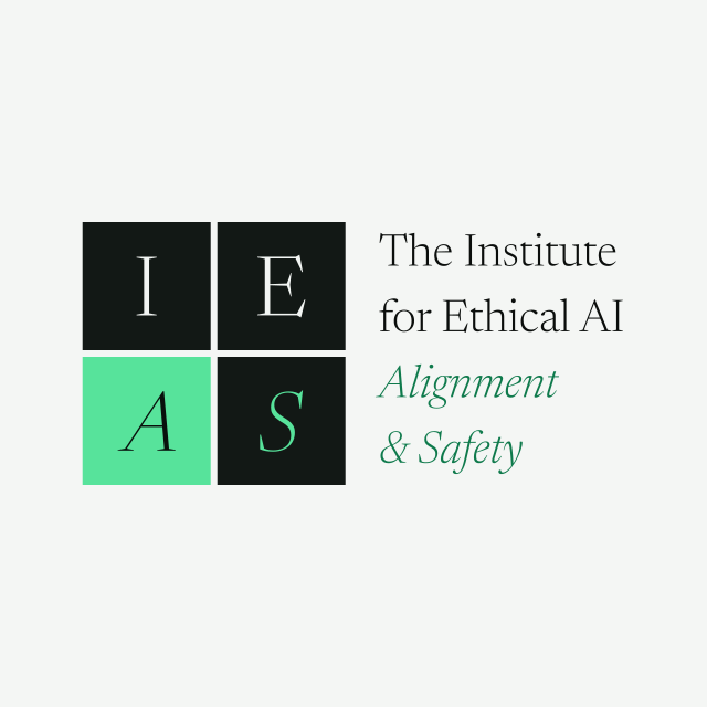
A typographic identity for the Institute: a two-line wordmark set in Newsreader, and a 2×2 mark built from the sentence's own initials. Every lockup below is type converted to outlines, so a lockup can never reflow or substitute a font wherever it is placed.
THE IDENTITY
The wordmark
The name is set in two lines: the roman line carries the institution, the italic line carries what it works on. The wordmark is the primary signature and should be given room; where a row is too tight for two lines, use the mark instead of shrinking the type.
THE MARK
Four initials, one square
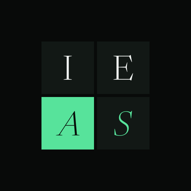
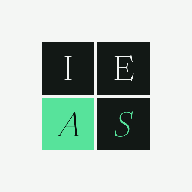
The mark takes the I, E, A and S out of the name and sets them in a 2×2 grid: I and E roman above, A and S italic below. The gap between cells is six per cent of the cell.
- I, E — roman, white on
#121815 - A — italic, knocked out of the accent cell
#57e39b - S — italic, accent on
#121815
The mark is theme-invariant: its cells stay dark on either background, so it reads as one solid anchor rather than inverting with the page. In the site header the mark is not a static image but the destination of a collapse: at the top of a page the header carries the full wordmark, and as the reader scrolls away its own four letters fly into the grid while the bar compacts around them. Scrolling back to the top reverses it.
LOCKUPS
The library
Eight lockups, each supplied for dark and light backgrounds. The artwork background is part of the asset, so a dark lockup stays dark wherever it is placed. Download the cut that matches the surface you are placing it on, not the page you are downloading it from.






COLOUR
The palette
Two cuts of one palette. Only the type colours change between them: the accent green is lifted off paper to #0f7a4c, because #57e39b on a light background falls to about 1.6:1 and fails contrast. Every value the mark uses is the same in both.
Dark
- --bg#080a09Artwork background
- --type#f2f5f3Roman lines
- --type-accent#57e39bItalic line
- --cell#121815Dark mark cell
- --cell-accent#57e39bThe A cell
- --knockout#08110cLetterform on the green cell
- --glyph-in-cell#f2f5f3I and E in their cells
- --glyph-accent#57e39bS in its dark cell
Light
- --bg#f4f6f4Artwork background
- --type#0b0e0cRoman lines
- --type-accent#0f7a4cItalic line, deeper for paper
- --cell#121815Unchanged
- --cell-accent#57e39bUnchanged
- --knockout#08110cUnchanged
- --glyph-in-cell#f2f5f3Unchanged
- --glyph-accent#57e39bUnchanged
TYPE
Newsreader
Newsreader at weight 300, roman and italic, is the identity's only typeface. It is self-hosted as a variable font with weight and optical-size axes, so the optical size follows the size the type is set at.
The Institute for Ethical AI
Alignment & Safety
Newsreader 300 roman · Newsreader 300 italic
USAGE
Working with the identity
- No border radius, no shadows, no gradients. The identity is flat type on flat colour.
- Place the outlined SVGs as files. They carry no font reference and cannot reflow or substitute.
- Do not re-typeset a lockup by hand. Centring a glyph centres its advance box, not its ink, and every cell in the mark carries a per-glyph optical nudge solved from the font's own metrics.
- Regenerate rather than edit:
scripts/build-logo-svgs.mjsis the source of truth for all sixteen files and both favicons, and it re-solves the nudges and the justified line sizes whenever the font changes.